Case 01
Juliana Lino Arq.
Brand, bilingual website and launch for an architecture studio, plus a page that sells technical drawing to other studios. From the brief to going live, done by one person.
- Client
- Juliana Lino Arq.Architecture and interiors · Brasília · 2026
- Role
- Strategy, brand, UI, copy and codeFrom the brief to deploy
- Deliverables
- Bilingual website and design systemHome, 10 projects and For studios · Figma prototype, desktop and mobile
- Tools
- Figma, Claude Code and VercelDesign, code and publishing
The problem
A brand that no longer fit.
Juliana has designed houses, renovations and interiors since 2018. Her work had matured, but the brand and the online presence still dated from the studio’s early days. She needed a brand and a website that matched the scale of her projects.
Decision 01
Before the screens, the map.
Two audiences share the same domain: people about to renovate or build, and studios that buy technical drawing. Before any screen, I drew the site map: every published page, where each link starts and where it leads.
All ten project pages end in Next, which leads to the following one.
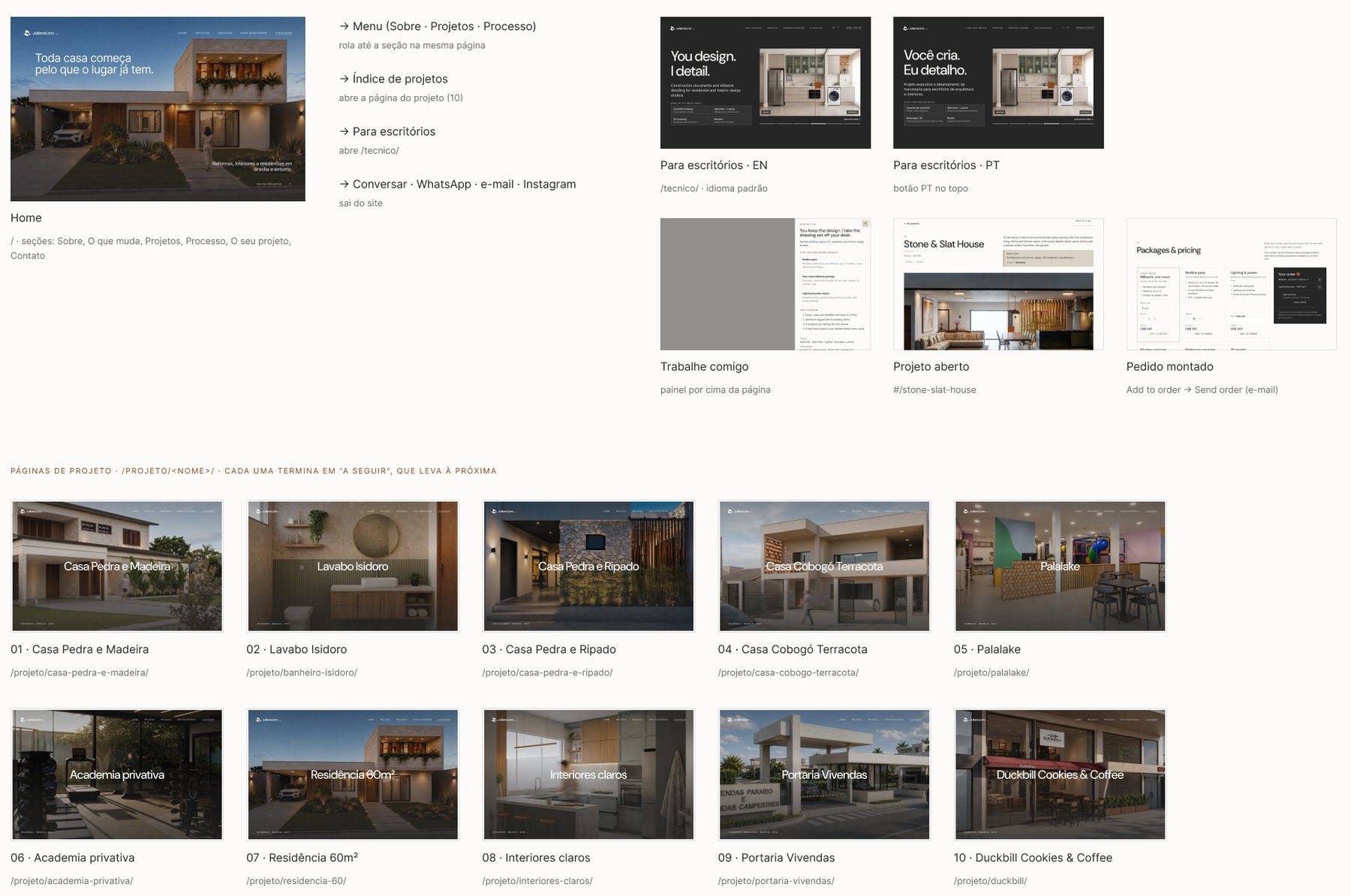
Site map and flowsFigma
Decision 02
A brand drawn like architecture.
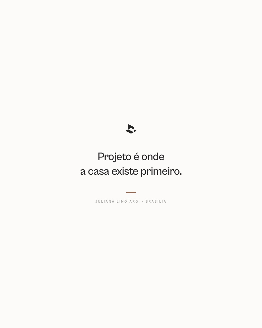
I redid the brand from scratch. The symbol is a volume drawn in axonometry, the drawing convention architects use for houses.

Decision 03
Five colors and not one more.
The whole site comes from a small design system: five color channels (ink, paper, sand, terracotta and warm paper) and no color outside them, two typefaces on a twelve-style scale, a 12-column grid on desktop and one column on mobile, six elevation recipes.
Components follow the same rule as the brand: label, arrow and hairline, no box around them. Figma documents what the code actually uses, so the file and the site never drift apart.
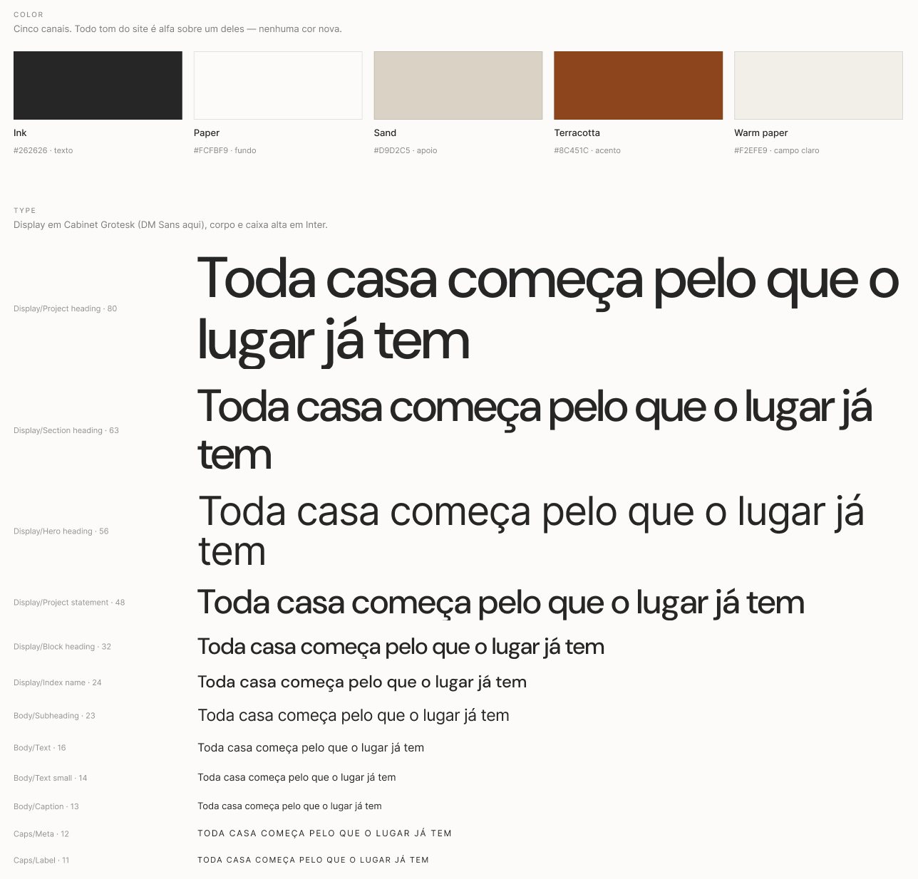
Color and type
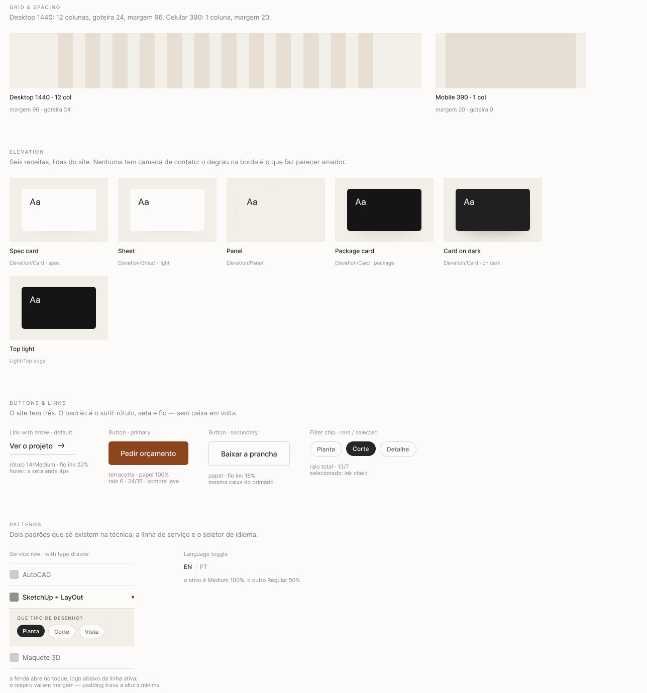
Grid, elevation and components
Decision 04
Structured minimalism.
Few elements and a lot of order. The project image fills the screen and the text comes in a few words, with italics only where it matters: measure, orientation and matter. It’s the decision I’d defend hardest in this project.
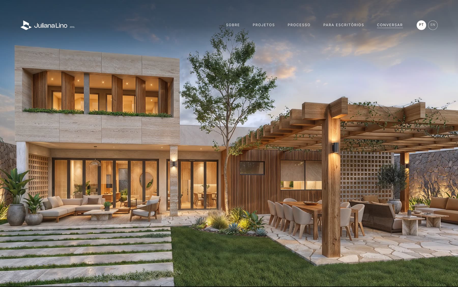
Home
Decision 05
Projects as an index.
Ten projects in a list with name, place and year, like the index of a book. The image appears on hover. Visitors see the whole body of work on one screen.
Project listhover
Decision 06
The process, told by a real project.
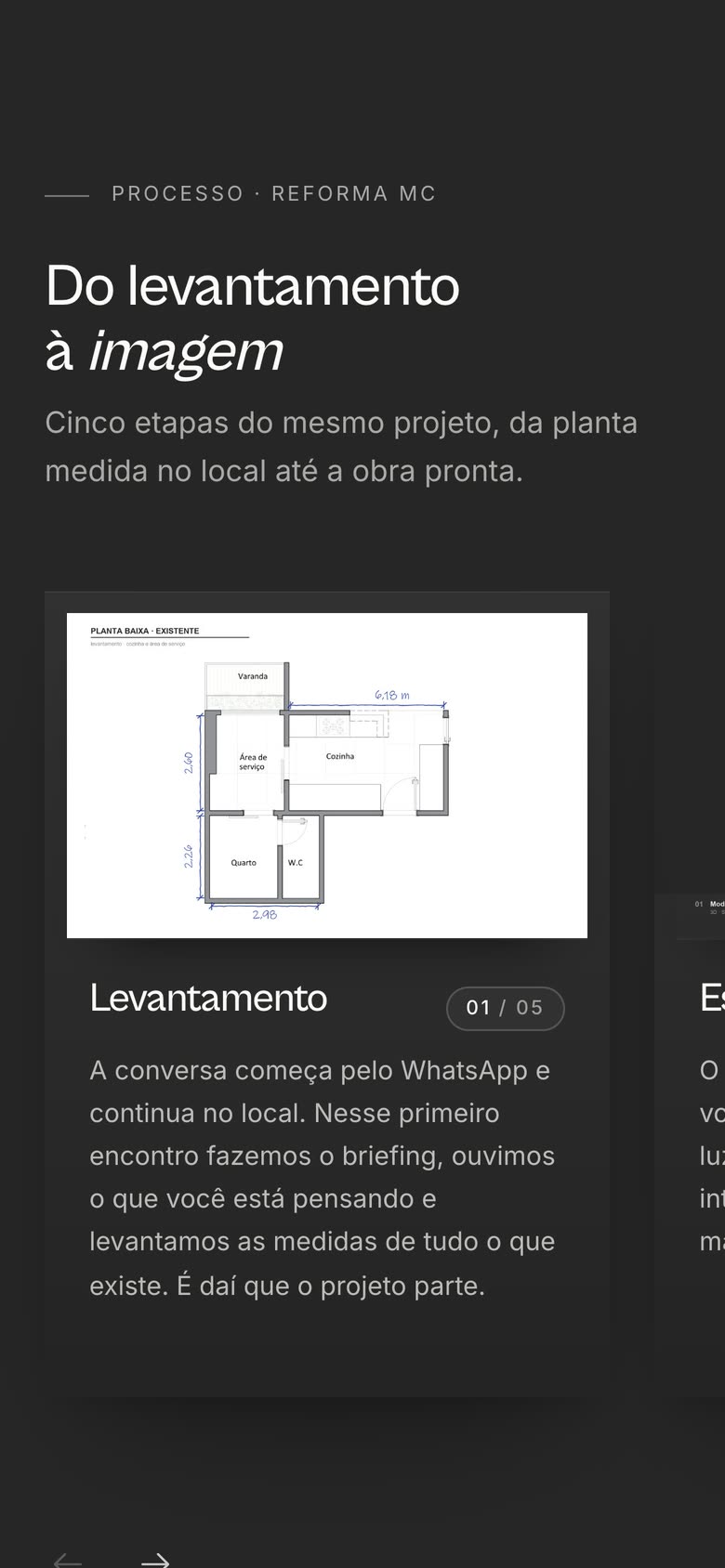
Architecture clients are afraid of the unknown. Instead of describing the stages in the abstract, the website follows one renovation from start to finish: five cards, from the on-site survey to the render, each with the drawing of that stage. Every project has its own page, with the story of the house before the images.
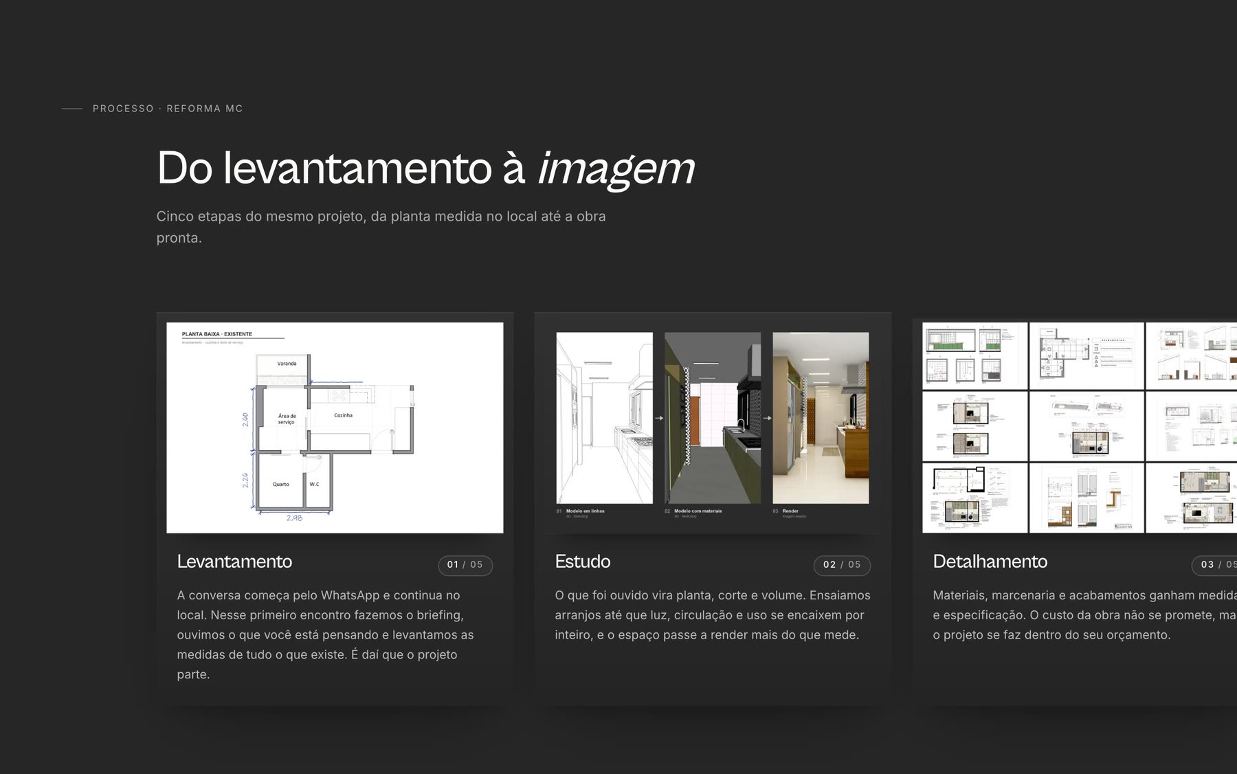
Process
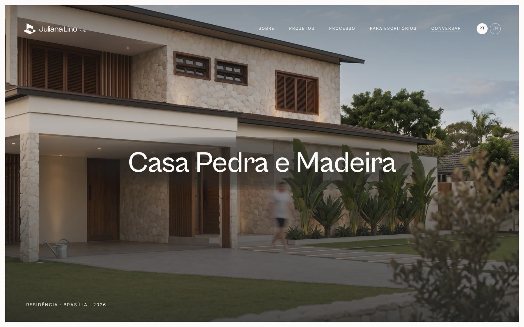
Project page
Decision 07
A second door: For studios.
Besides homes, Juliana sells technical drawing to other architecture studios: construction documents, joinery details, 3D models and renders. The menu label tells who the page is for, For studios, so the homeowner knows it is not for them.
A studio that outsources drawing buys a quality that text cannot show. So the drawing sheet sits at the center: choosing a service brings up that service’s real sheets right beside it. The process is told on a real floor plan, and the page has no prices, only packages and a quote request.
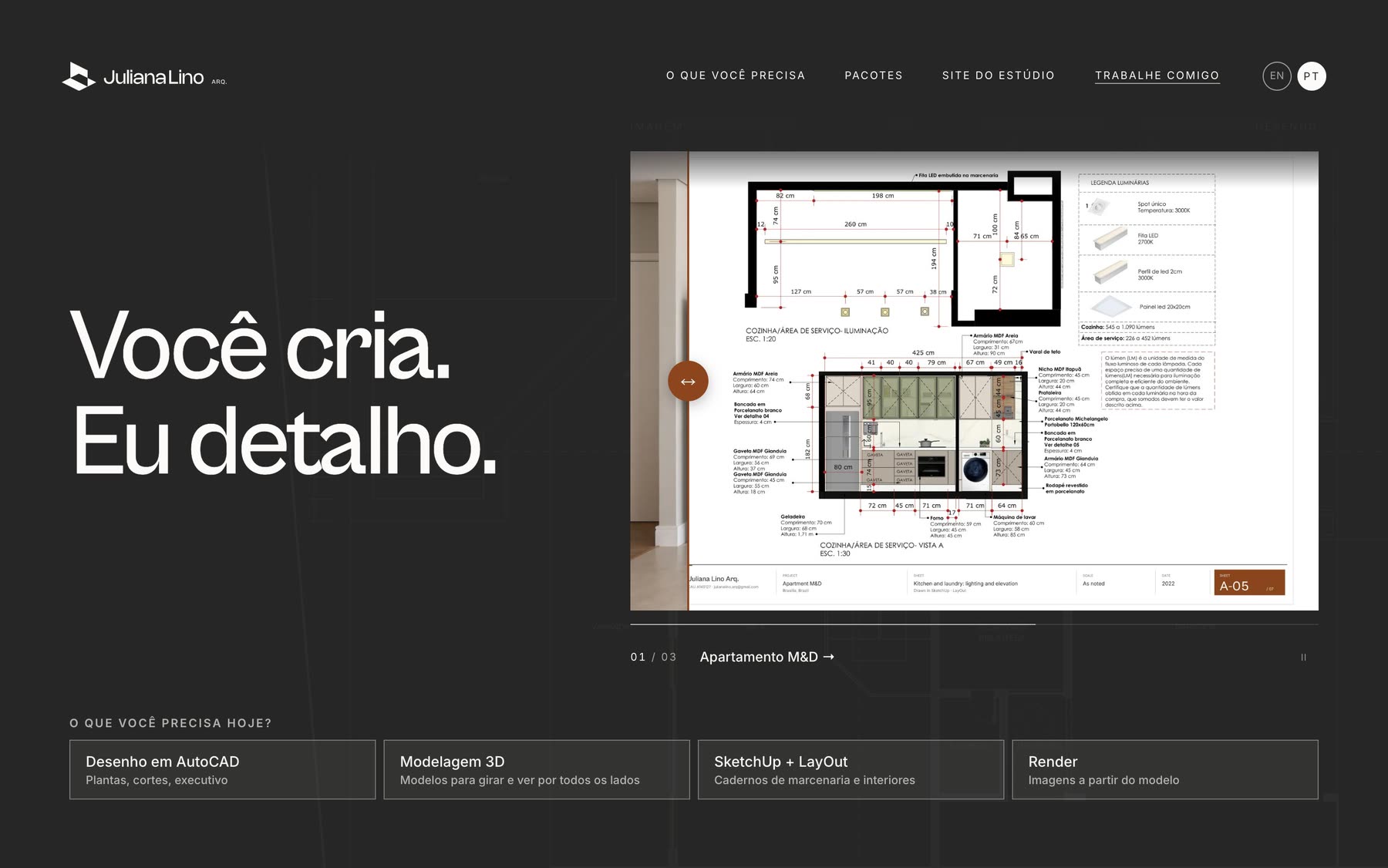
For studiosopening
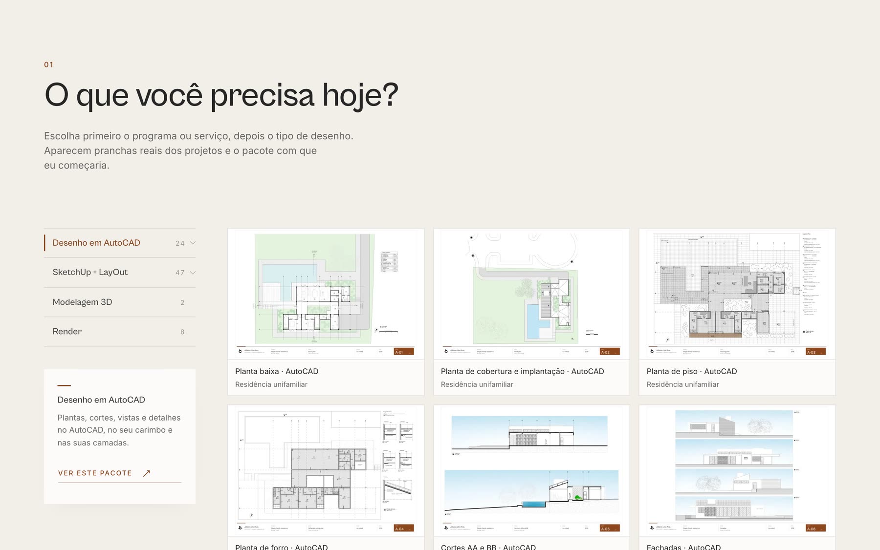
The choice next to the sheets
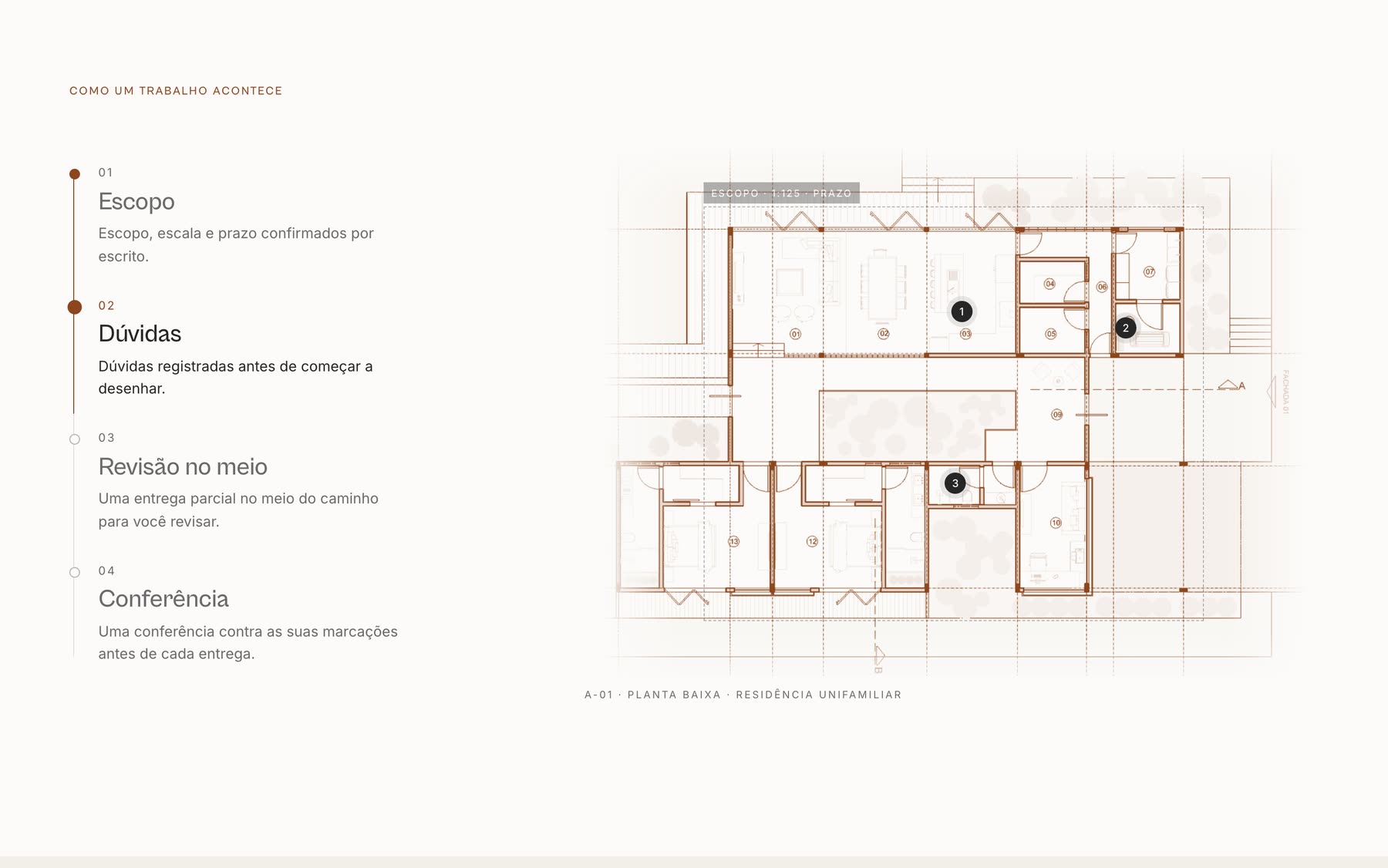
The process on a real floor plan
Decision 08
Mobile, page by page.
Every page has its own 390-pixel version designed in Figma, and the prototype runs at both widths. On mobile, the menu opens on top and the Process and photo carousels scroll with a swipe.
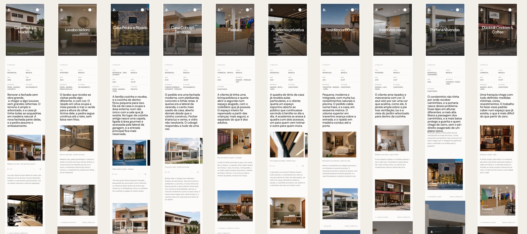
The 10 project pagesmobile 390
Decision 09
A launch in the same language.
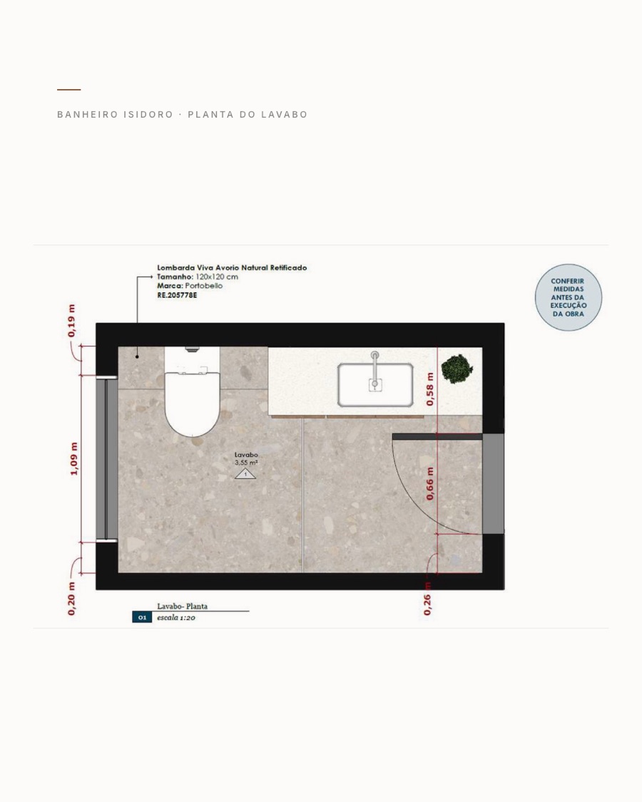
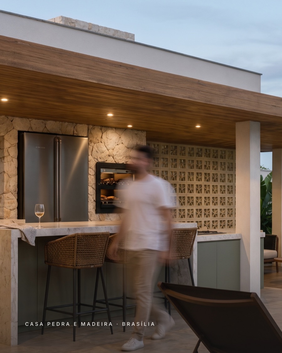
The Instagram launch uses the same system as the website: technical drawings, isometric views, the typography and the project images.
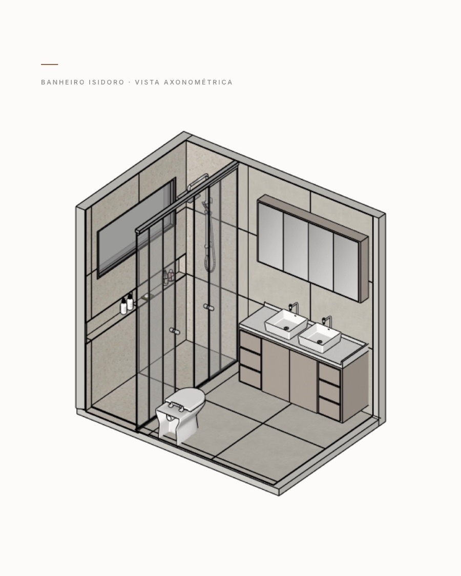
How AI came in
AI builds. I decide.
I used AI to organize references, propose the page structure and write the code. The art direction, the typography, the hierarchy and every visual decision were mine. The back and forth happened in the browser, with the site running, until every detail was right.
Mobile
What changed
A brand she recognizes as hers, live.
Juliana got a new brand, a website live at julianalino.com in Portuguese and English, a page to sell technical drawing to other studios and a launch campaign ready for Instagram. She liked the references as much as the result.
Next case
Acervo